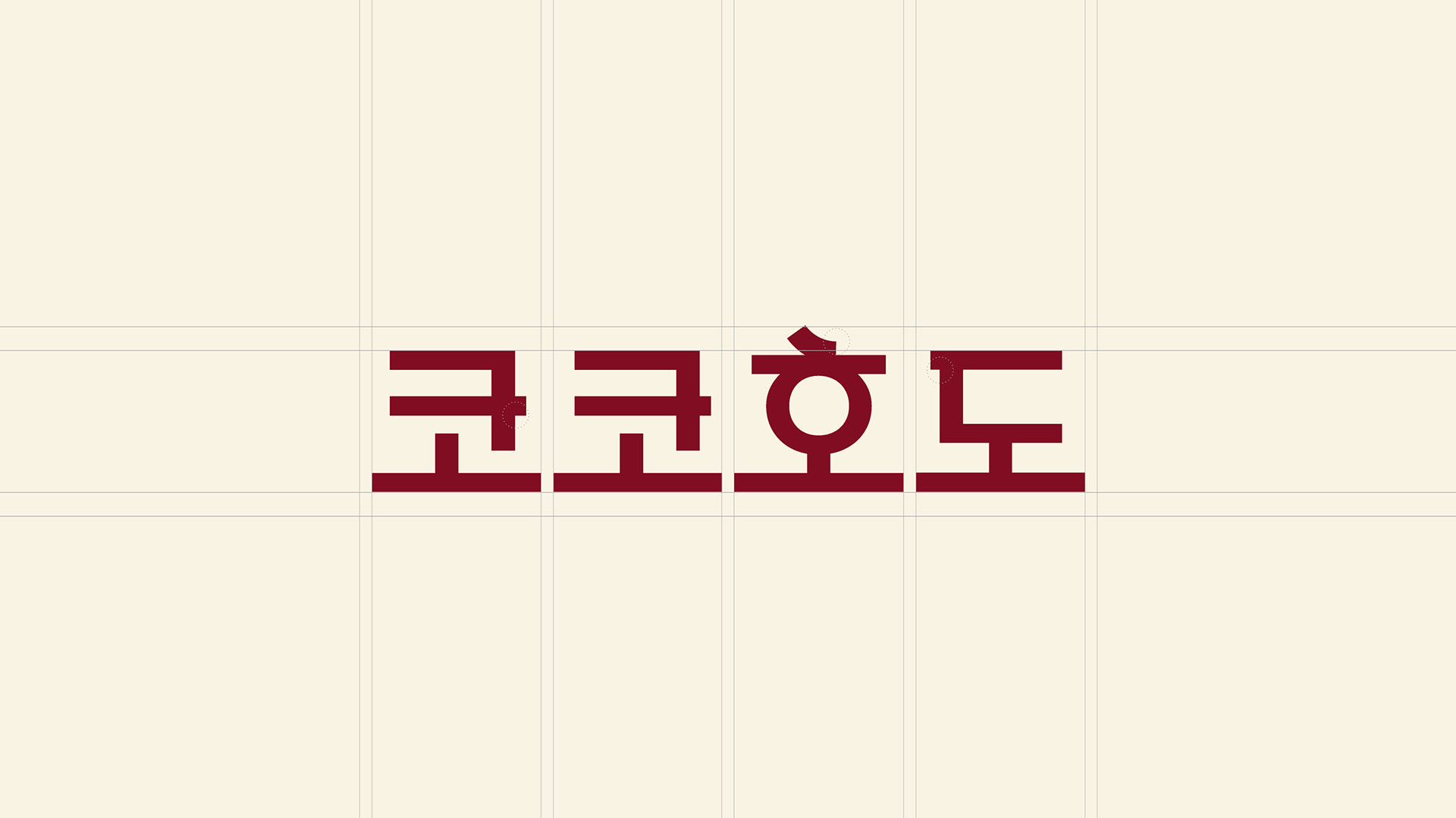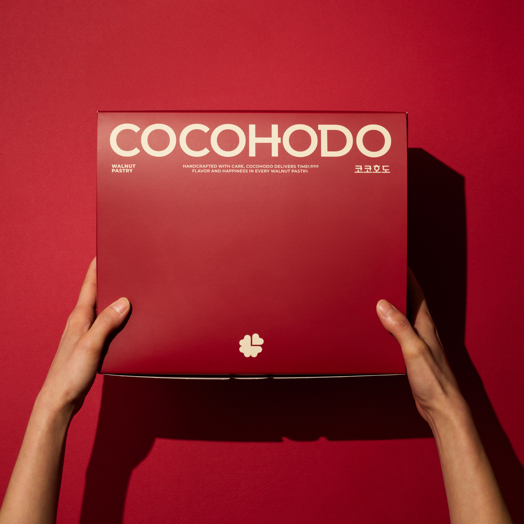
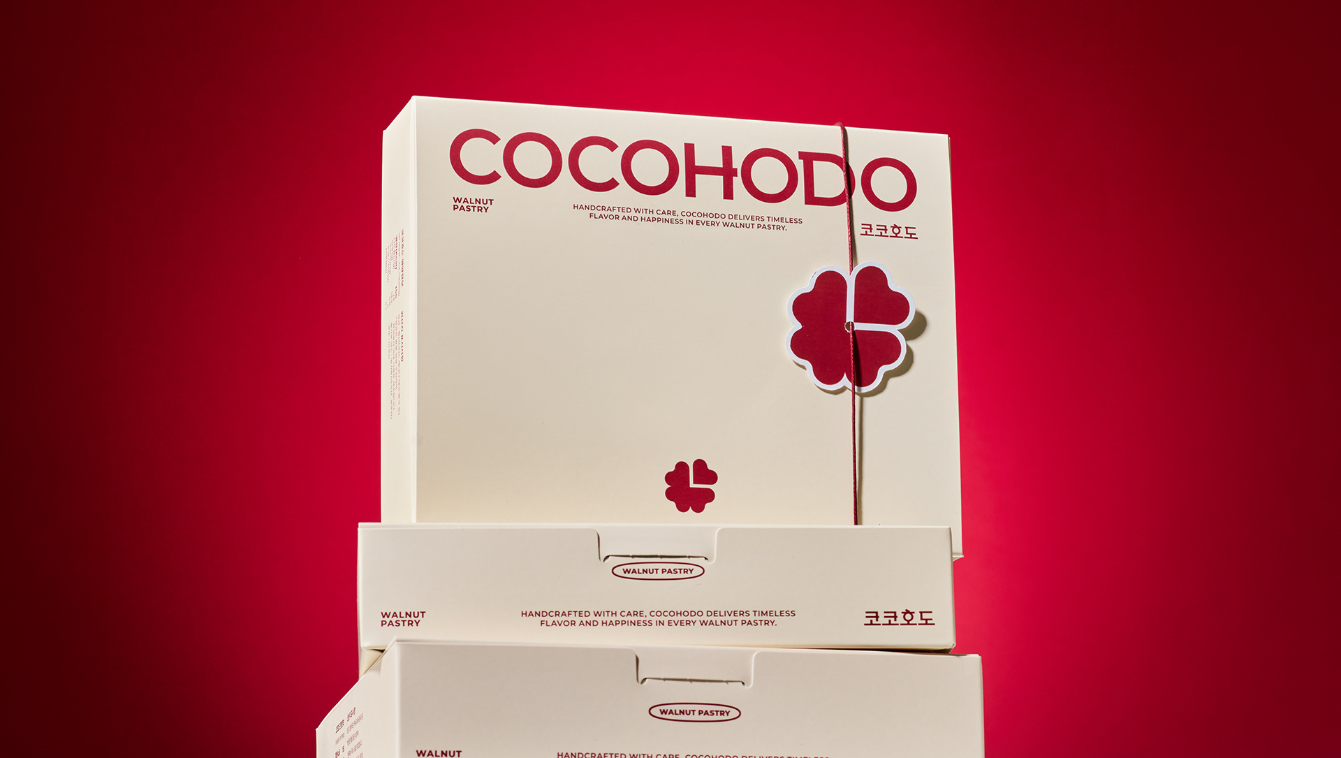
We led the brand renewal of COCOHODO.
Inspired by walnuts and walnut pastries,
the reinterpreted symbol reflects the brand’s core value of sharing.
Our key message, Share Moment, represents time shared and moments completed together.
the reinterpreted symbol reflects the brand’s core value of sharing.
Our key message, Share Moment, represents time shared and moments completed together.
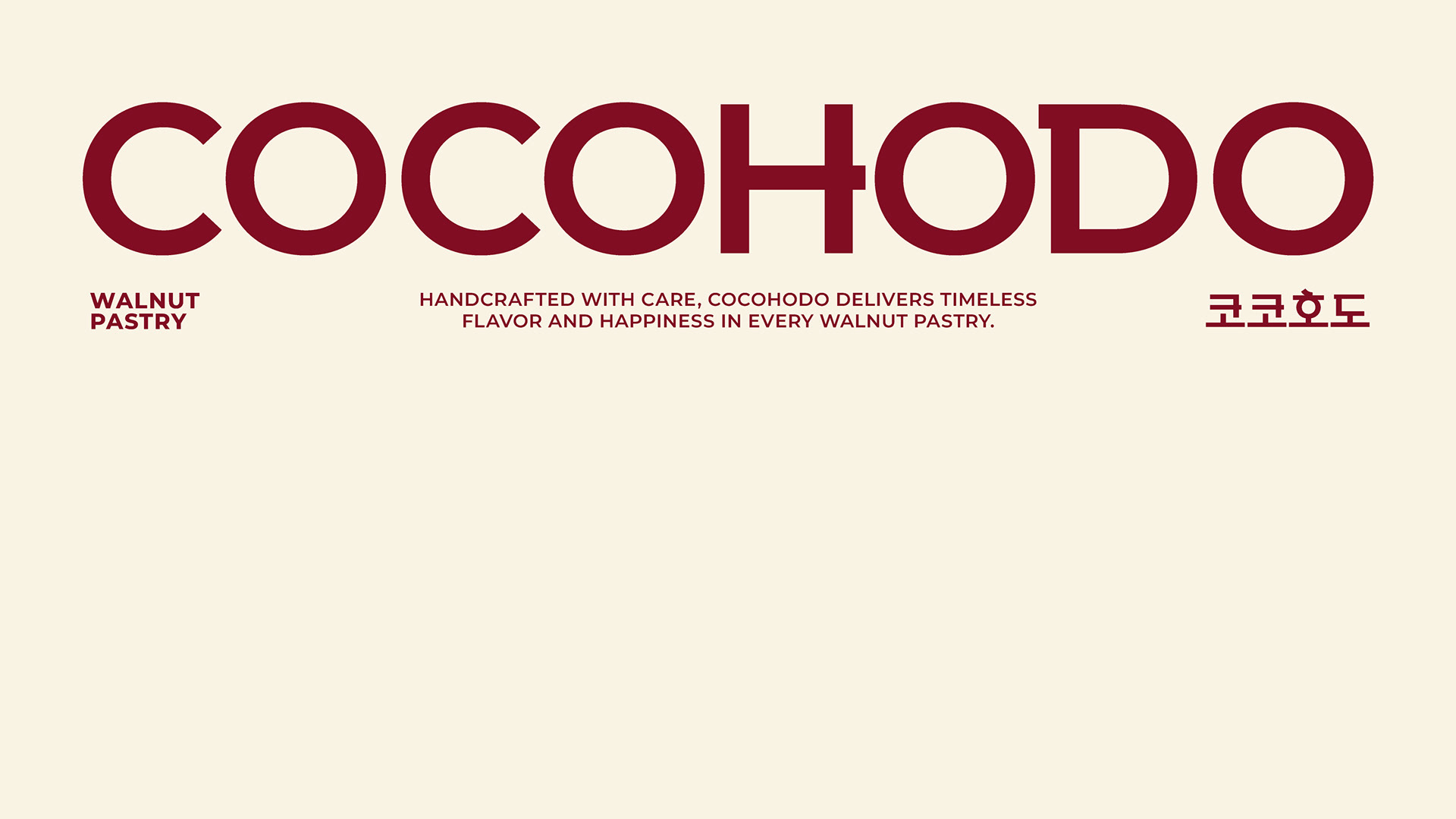
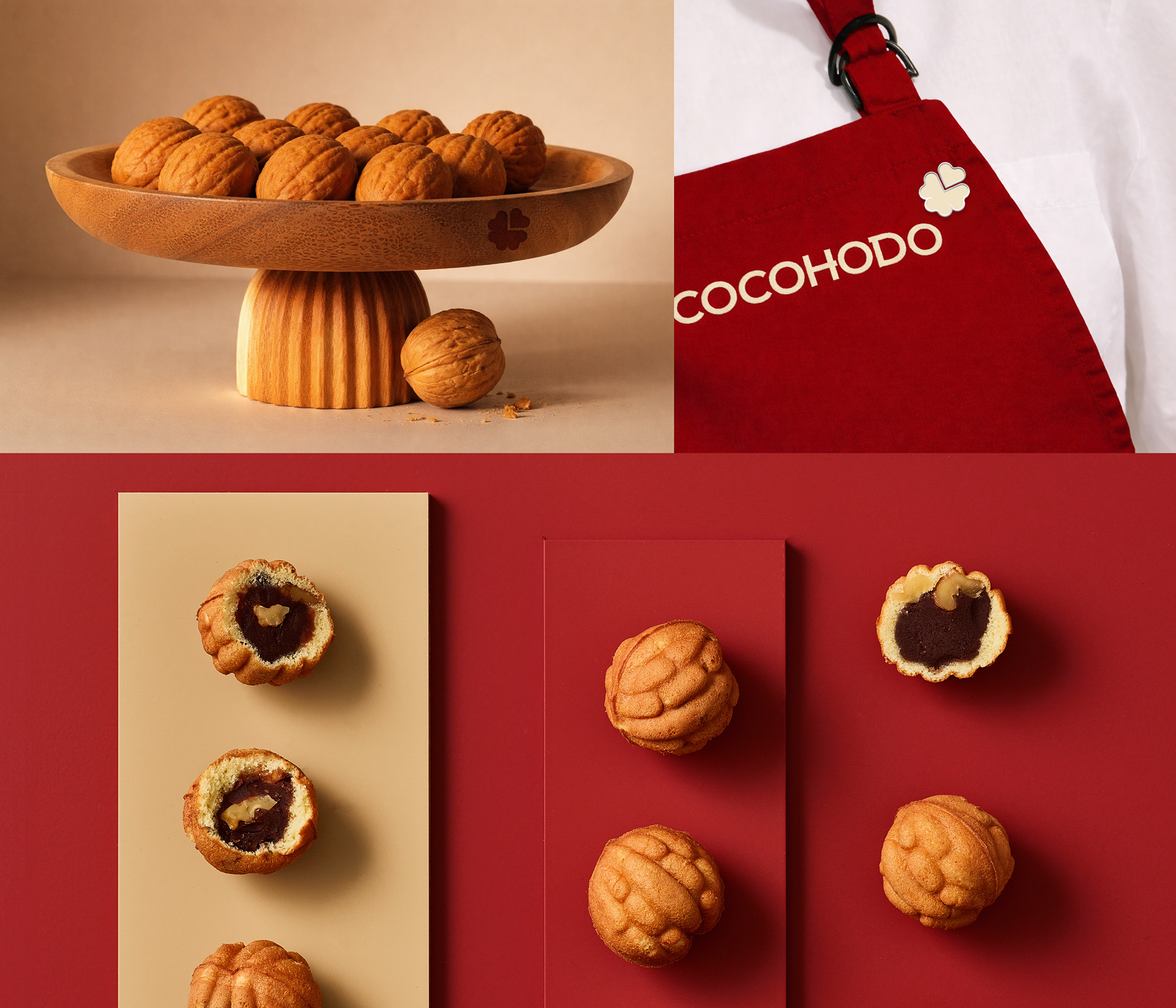
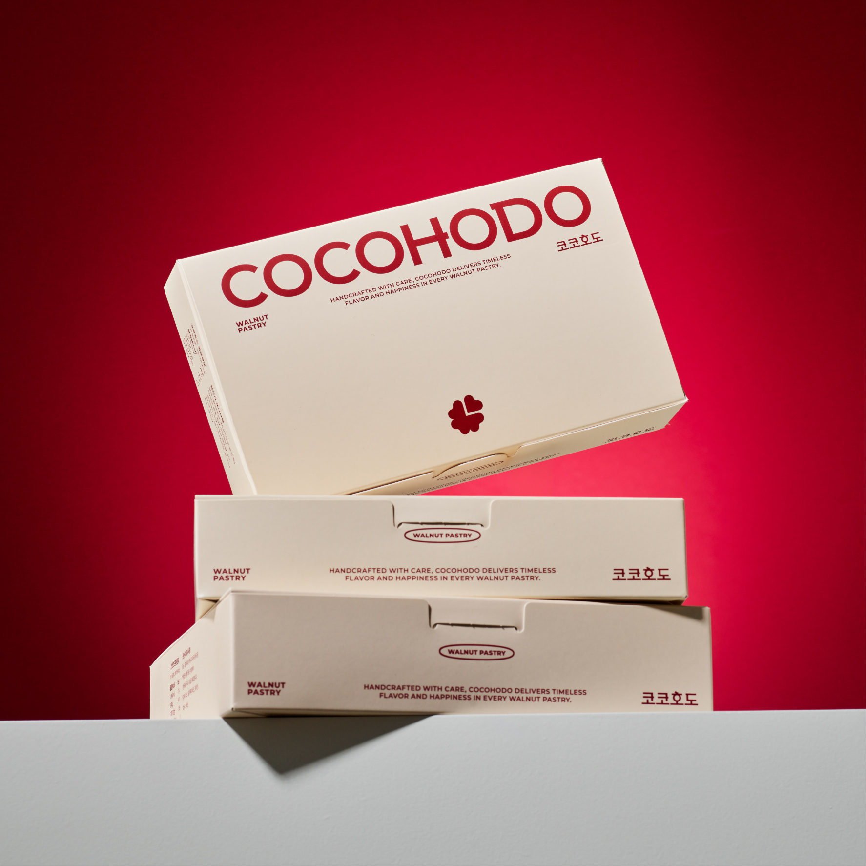
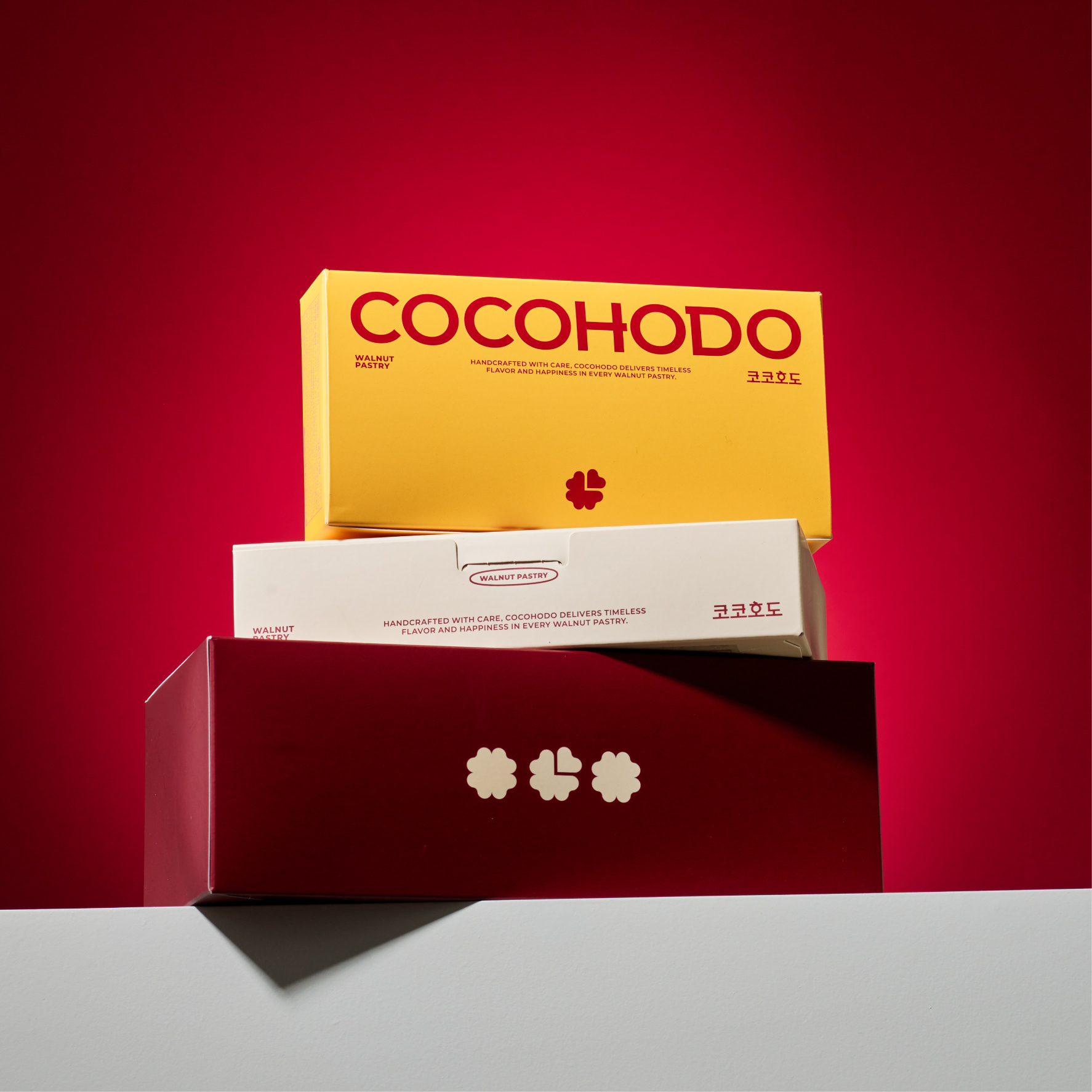
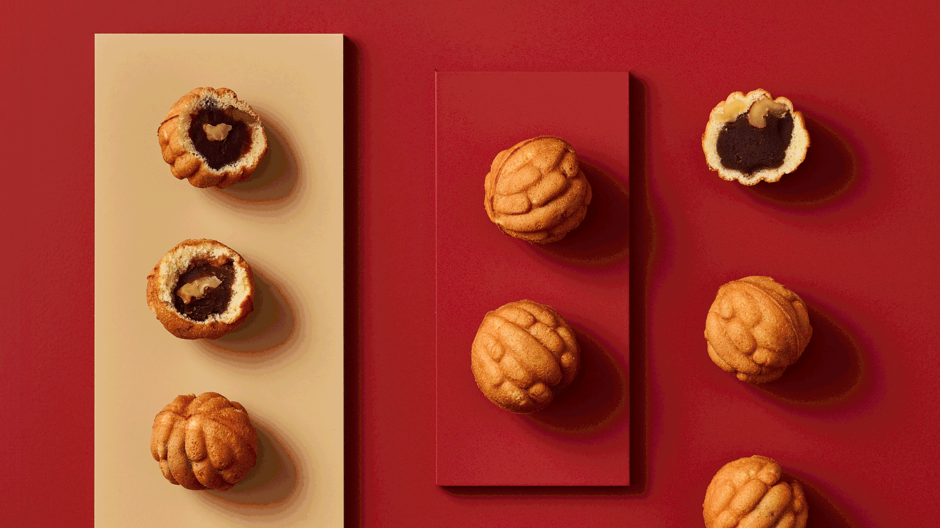
The color system originates from the ingredients —
cream white for flour, deep red for red bean paste, and rich yellow for butter.
By translating authenticity into a visual language, we rebuilt the foundation of the brand identity.
cream white for flour, deep red for red bean paste, and rich yellow for butter.
By translating authenticity into a visual language, we rebuilt the foundation of the brand identity.
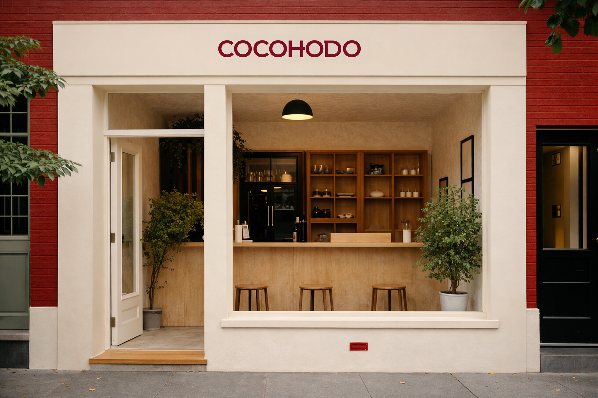
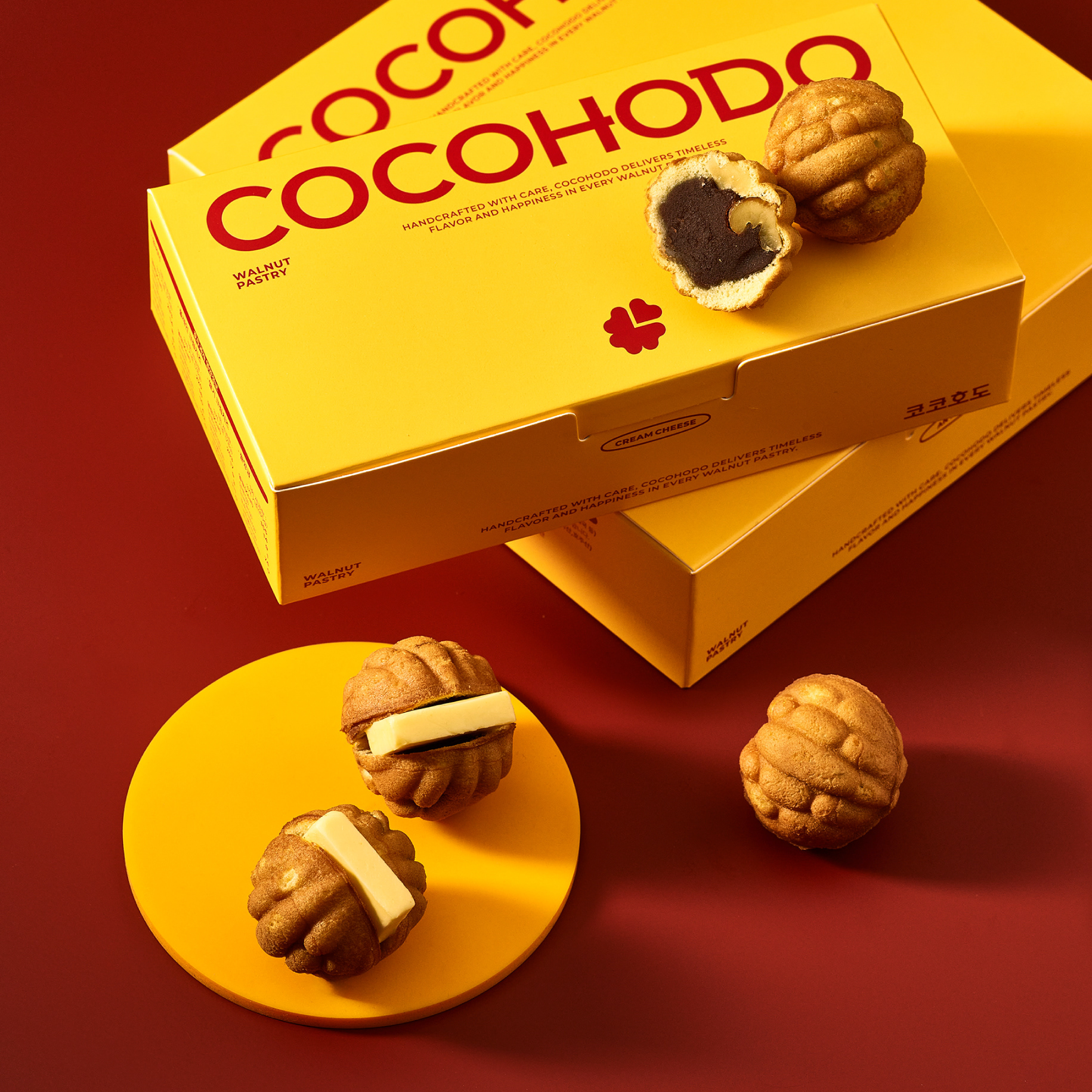
Redefining walnut pastry beyond tradition,
we repositioned COCOHODO as a modern dessert brand
with refined structure, restrained graphics, and clear typography.
we repositioned COCOHODO as a modern dessert brand
with refined structure, restrained graphics, and clear typography.