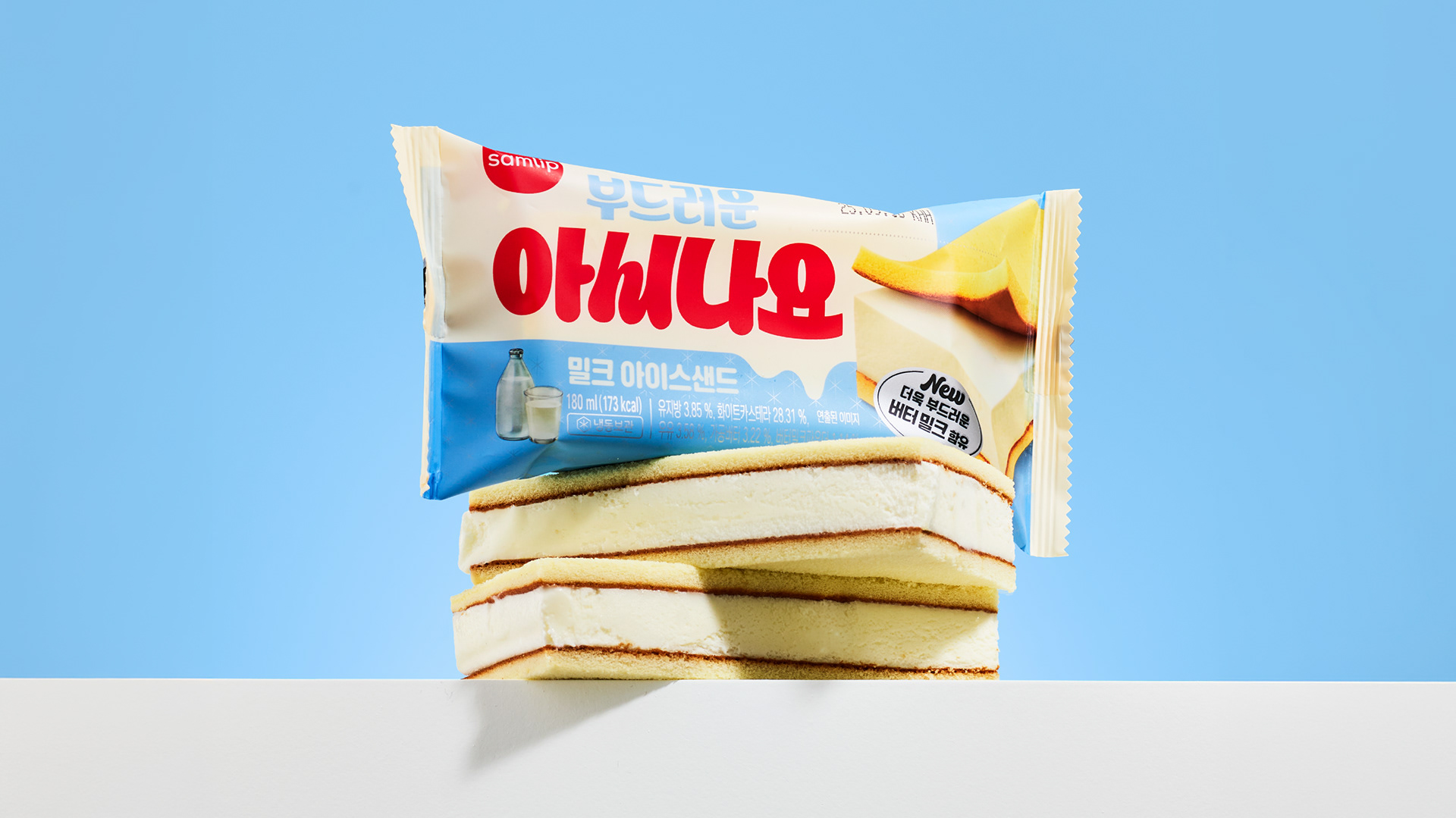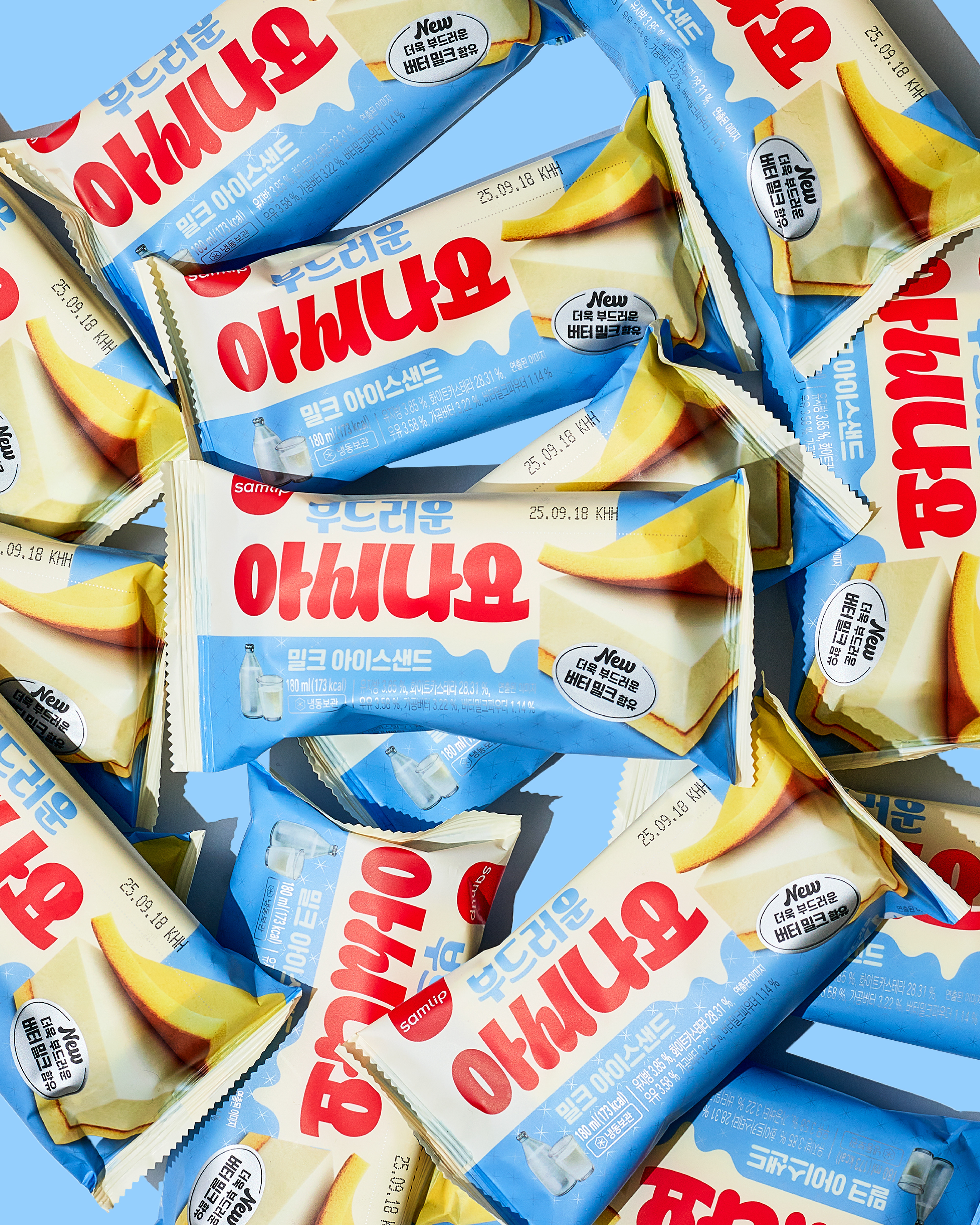
We collaborated with the Samlip design team to renew the packaging design for Ashinayo.
First launched in 1984, Ashinayo is a beloved ice cream sandwich brand in Korea. This redesign repositions the brand with a younger and more eye-catching identity.
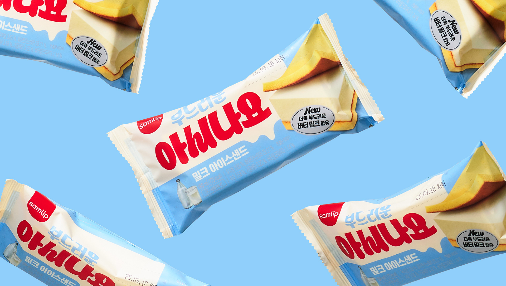
First launched in 1984, Ashinayo is a beloved ice cream sandwich brand in Korea. This redesign repositions the brand with a younger and more eye-catching identity.
The Ashinayo typography was inspired by the form of a sandwiched ice cream layer, visually reflecting the product’s structure.
An ivory and sky-blue color system evokes the soft and sweet qualities of milk ice cream and castella cake.
An ivory and sky-blue color system evokes the soft and sweet qualities of milk ice cream and castella cake.
A bold ice cream sandwich visual is placed at the center of the package to communicate the product instantly, while vibrant colors and graphic elements enhance shelf visibility and product recognition.